UX Failures on Lego.com and at Petro Canada
I’ve been doing a lot of reading about usability. It’s made me think a lot about the user experience when I’m designing and developing. It’s also made me think a lot about the user experience when I’m NOT doing anything computer related.
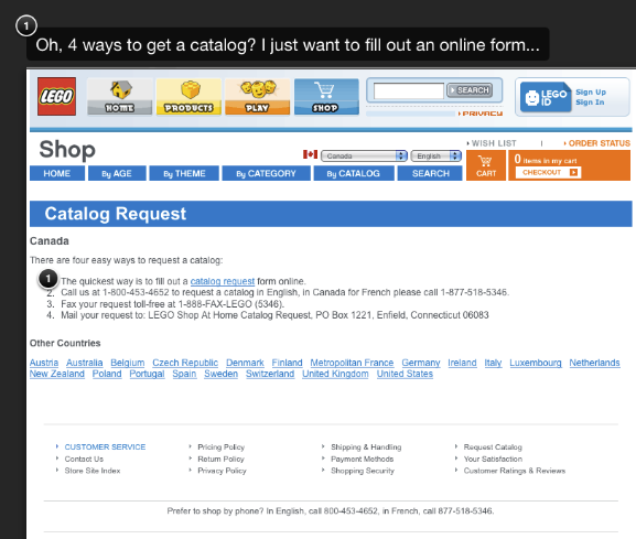
Lego.com Catalog Request
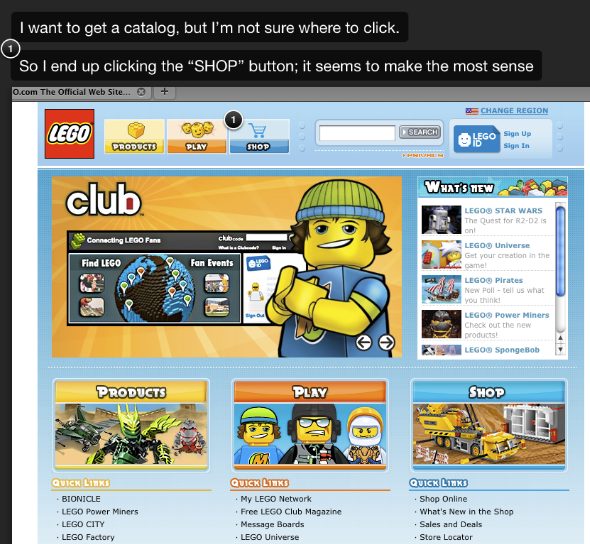
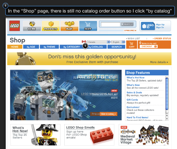
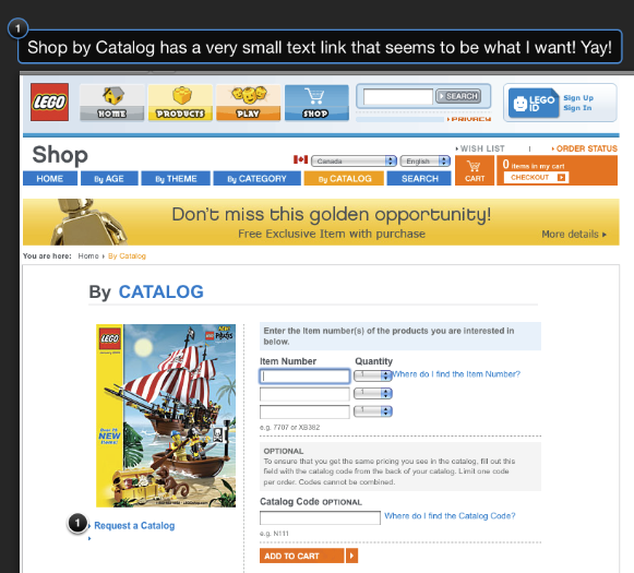
I recently went to the Lego website to try and get a catalog sent to my house. I remember reading through these catalogs as a kid and coming up with all sorts of creative things I would be able to do when/if I received a certain set.
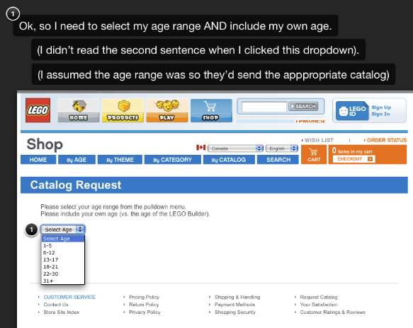
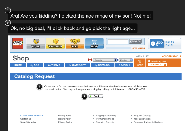
Heck, half the fun for me was just looking at what the Lego designers had come up with. So yesterday I wanted to order a catalog for Andy, my 2.5 year old son, as he’s been really enjoying our Lego collection. When I got to the last screen in the slideshow and tried to go back to re-enter my correct age, it wouldn’t let me! It cookied me and I had to clear my cache to be able to re-enter the form information. Grrr..

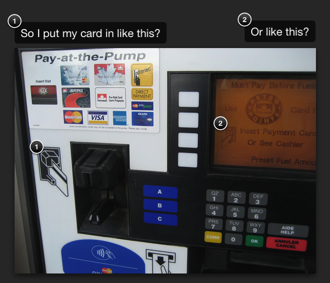
Petro Canada Gas Pumps
I went to fill up my car the other day, and wanted to pay at the pump. There were 2 icons to display the “right” way to insert my debit card… which one was the right one?