Static Design Processes lead to Usability Failures
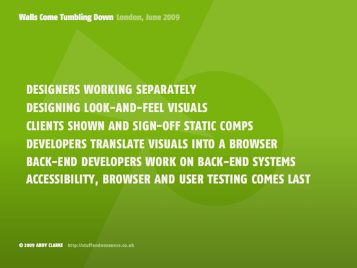
Since my excursion to AEA ‘09 in Boston I’ve been doing a lot of thinking about all of this “User Experience” stuff. Much of what Andy Clarke said in his Walls Come Tumbling Down presentation has been ringing around in my head, resonating with so much of my experiences over the last few years. Without diving into the entire presentations coverage of the current economic situation being a stimulator for workflow process change, I want to focus on a few thoughts from 1 slide in Andy’s presentation.

Designers work on static look and feel visuals
There is a design disconnect problem when the medium we publish to (the web) doesn’t match the medium we design in (static images). The web is dynamic, elastic, portable, modular and can be repurposed in any number of ways. Many web designers work in Photoshop and Fireworks to produce mockups that are static, rigid, not portable and often discarded after the initial design process.
By designing in these static tools it is nearly impossible to answer the “what if?” type questions that we need to be asked in order to improve the efficiency of our design process and, most importantly, the usability of our websites and applications. What if the font size is increased by the user? How does that affect neighboring content? What happens if this column appears second in the markup? These things are all dynamic in nature and these questions cannot be effectively answered when the tool we use to produce mockups is static in nature.
Designers and developers often work separately
I firmly believe that if we are to improve the user experience of our applications that designers and developers need to work in harmony from the very beginning. Traditional “designer/ux” work processes such as paper prototyping, white-boarding and lo-fidelity mockup construction should be participated in by developers. In fact, the entire design process needs to have input from both designer and developers in order to be successful. Far too often designers pitch concepts and hi-fidelity mockups “over the wall” to developers once things have been finalized, creating a disconnect between the two; this promotes division and resentment.
Designers often don’t understand the limitations that might be imposed given the technology that developers have been given to work with, and developers often don’t understand the usability considerations that went into design decisions. Developers might have insight into usability based on past experience that can go unheard because they aren’t included in the design process, and designers might know what the best way to develop a certain feature might be. (You can see how this could go on and on).
In a perfect world we’d all be designer/developers with the capability to have enough foresight to solve all these problems before they happen; unfortunately this is not a perfect world. I think the solution to this disconnect isn’t that complicated though; mutual respect for each part of the process is a start. If design and development can co-exist with unburdened communication in the early stages of a project things will be in much better shape. Part of this has to do with breaking down the traditional barriers that seem to exist between these two disciplines, but I believe Kent Beck covers this subject in much more elegance than I would.
Testing accessibility often comes last
It’s interesting to me that the people we build websites and web applications for are often consulted last when it comes to design and usability considerations. Even when there are people on a project team who have usability experience it seems that they are the ones consulted when really we should be pouring our initial efforts into getting feedback from potential users. It is so arrogant of us as designers/developers to make assumptions about what is “best for the user” without ever asking them.
This can be a hard problem to tackle because many teams don’t have dedicated testers and some teams utilize developers to do nearly all of the functional testing. Developers can test, but they aren’t the best testers in my opinion; developers are often working in an isolated area of a website/application and don’t have the “birds-eye view” required to really understand how all of the components fit together. When developers are the primary people doing user/functional testing, and this testing comes at the end of an iteration it can lead to design implementations that often overlook simple usability problems.
These problems are all solvable, they just involve a lot of open communication and respect between developers and designers and the willingness to abandon processes that are based on static models. The web is dynamic and we should be in our design/development methods as well.
