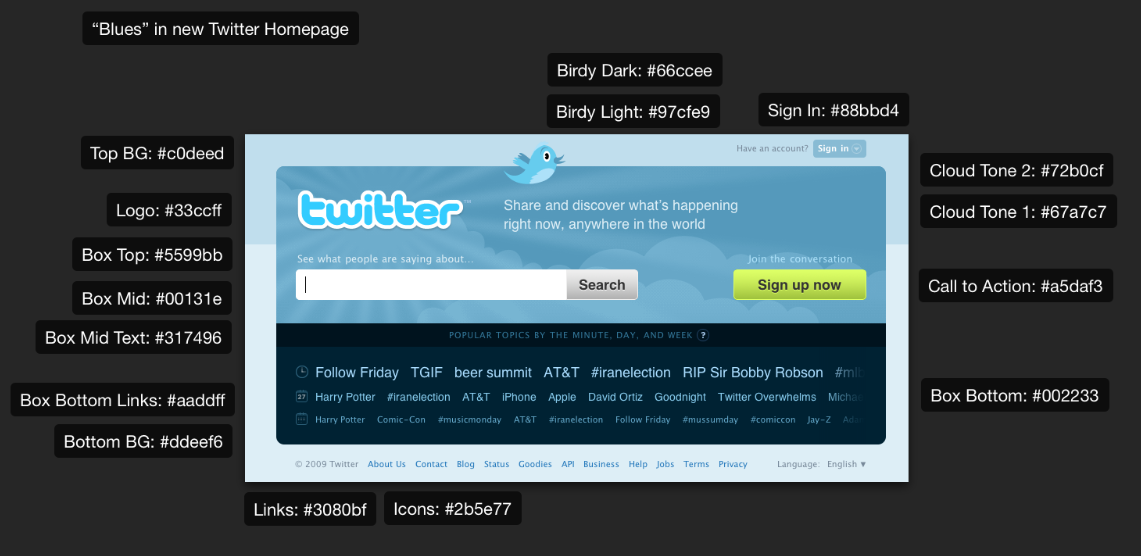
The new Twitter homepage, now with 114% more blue
Everyone has been submitting reviews of the new Twitter homepage. Most of them focus on usability or how the brand will be affected with search being front and center. I’d like to forget all that for a moment and strictly focus on the most significant change of all: the addition of over 114% more blue on the new homepage. Yes, that’s right, there’s much more blue in the Twitter brand and I found it interesting to take a look at some of the differences with a few screencaps.
The new homepage does indeed have a new logo and a radically different look than previously and without digging into that too much I’ll just say this: I do like the new look and feel. However, I do have to ask the question: “Why so much more blue?” Does the extra blue help or hinder? Is it too busy or does it help unify things on the page more? What do you think?